An IELTS prep centre in Almaty is running a test on Meta, and one of its ads opens with "Pauses in speaking cost you points". A student with the exam three months away recognises herself and taps. The first screen of the site has the headline "IELTS preparation in Almaty", under it "Experienced teachers, modern methods, a convenient schedule" and a "Send" button. The ad talked about her problem; the site talks about itself.
A value proposition answers three questions a person asks on the first screen while deciding whether to scroll on or close the tab: what do I get, why should I believe it, and what do I do next. In this lesson you will build that answer for the IELTS centre and then use the same formula to rewrite the first screen of your own test site. The centre's copy and prices are an example, the same ones used in the creatives for the test.
Job, result and proof
The structure of a value proposition is easier to see on a product far removed from advertising. At the end of each month an accountant reconciles a payout register against a bank statement and payment orders by hand. You could describe a reconciliation service to her in two ways:
- "A modern, next-generation platform";
- "Pull your payouts into one reconciliation and find the discrepancies before the month closes".
The first line conveys the impression the seller wants to make. The second names the accountant's job (reconciling payouts), the result (finding discrepancies) and the moment it matters (before the month closes). In the second she recognises her own month-end; the first gives her nothing to recognise.
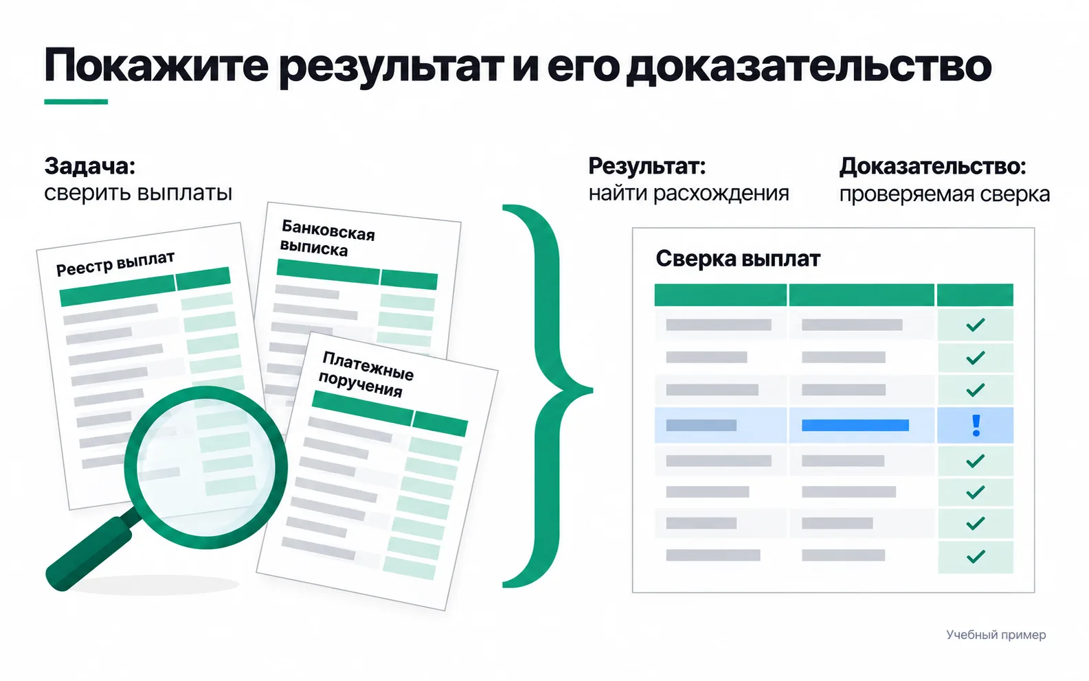
Still, the second line is only a promise. The accountant will believe it once she uploads her own register and statement and sees a flagged row she would have missed. If the service misses things on real files, good wording only gets her to disappointment faster. So you first make sure the product does what it says, and only then put the promise on the site.
These three parts make up a value proposition: whose job it is, what result the person gets and how you back that up. Strategyzer lays out the same thing on the Value Proposition Canvas. One half is the customer profile: their jobs, pains and the gains they hope for. The other is the value map: your products and services and how they relieve the pains and create the gains. The canvas works well as a list of questions. But fill it in at a desk and it holds your guesses about the customer, which only conversations with customers and the way people use the product can confirm.
Learn the customer's job from the customer
Before you write a headline, talk to five or six people who are preparing for IELTS now or took it recently. Ask about what happened: when the exam is, what the score is for, how they prepared before and where they got stuck. Ask "Would you take a course with a convenient schedule?" and people will say yes to be polite. Ask "What did you do when you realised your speaking wasn't good enough?" and you get a story, and its words later end up on the site. These conversations are called in-depth interviews, and the main thing in them is to ask about the past.
Sort your notes into two columns straight away: what you learned and how the centre can respond. The exam is in three months and the score is needed for university admission, so the centre answers with a preparation plan built around the exam date. Pauses in speaking are met by a review in the trial lesson, not knowing one's level by a test, and the fear of paying for three months and being disappointed by a free trial lesson before paying.
Not every wish belongs in the offer. If someone also asks for SAT prep and the centre has no SAT course, you have found a boundary of the product. Better to name it than to stretch the promise over everything.
Promise what depends on you
The owner wants the site to say "IELTS 7.0 in three months". It sounds strong, but the score depends on the student: their starting level, how much they study at home, how they feel on exam day. The centre is responsible for something else: the plan, the mock exams and the review of mistakes. That is its result.
Break the offer into three columns: what you have, what the person gets from it, and how they can see it for themselves before paying.
| What the centre has | What the person gets | How to see it before paying |
|---|---|---|
| A level test | Knows the level they are starting from | The test in the free trial lesson |
| A speaking lesson: 15 minutes of answers, 15 minutes of review | Sees where they lose points and knows what to do about it | A trial lesson in the same format |
| A preparation plan and a mock exam | Prepares for their own date to a plan, not by working through a textbook | A sample plan on the site |
| A three-month course at 45,000 ₸ a month, paid month by month | Knows the duration and the cost up front, and decides one month at a time rather than all three at once | The same price on the site and in the ads |
The centre's strongest proof is the free trial lesson: the person tests the promise themselves before paying. A "loved it" review carries less weight: it tells you the author enjoyed it, not what they got. And a figure like "our students' average score is 7.0" goes on the site only if the centre has calculated it and can show how many students and which period it covers.
The first-screen formula: result, proof, step
The first screen is what a person sees on their phone before the first scroll. It has three elements, and each has its own task.
- Headline: the result. What the person gets, in their words: the job and the result, plus a time frame if it matters. Not the name of the service, not a slogan.
- Subheading: the proof and the terms. How you deliver it, what can be checked before paying, what it costs and how long it takes. The headline makes the promise; the subheading explains why it can be believed.
- Button: the step. A verb, plus what the person gets when they tap it. Under the button, one line on who will reply and when.
Hence the formula for this lesson: result, proof, step. Here is the centre's first screen before and after.
| Element | Before | After |
|---|---|---|
| Headline | IELTS preparation in Almaty | An IELTS preparation plan for your exam date |
| Subheading | Experienced teachers, modern methods, a convenient schedule | In a free trial lesson we'll test your level and show where you lose points in speaking. Three-month course, 45,000 ₸ a month |
| Button | Send | Book a trial lesson |
Under the new button: "A manager will message you on WhatsApp within an hour".
The old headline is the name of the service, and any competitor's first screen could open the same way. The new one says what the person gets and ties it to their own exam date. The old subheading lists three qualities any centre could claim, and none of them can be checked. The new one describes what happens in the trial lesson and states the duration and price right away. "Send" describes what the form does; "Book a trial lesson" describes what the person gets.
The new screen continues all three creatives from the test. The ad about pauses in speaking continues in the subheading, the ad with the price in the amount, the ad about the lesson in the description of the trial lesson. The person sees the same promise on the site as in the ad and doesn't have to wonder whether they've landed in the right place.
Put limitations next to the benefit, not at the bottom of the page. If the centre only prepares for IELTS Academic, say so right under the subheading. Someone who needs General Training leaves at once rather than after a conversation with a manager, and the manager's time goes to people the course suits.
Compare with three competitors
While the new screen stands alone, it is easy to overrate. Put the first screens of three competitors next to it. They are easy to find: a Google search for "IELTS preparation Almaty", the centres listed on 2GIS, and the Meta Ad Library, which shows all active ads, so you can find a competitor's ad and open the page it leads to. Take the screenshots on a phone: someone who tapped an ad on Instagram sees the mobile version.
Put the four screens into a table:
| Site | What the headline promises | What backs it up | Button and what happens next |
|---|---|---|---|
| Yours | |||
| Competitor 1 | |||
| Competitor 2 | |||
| Competitor 3 |
Look at three things. First, what all of them repeat. If all four say "experienced teachers", those words don't help anyone choose, and the space is better given to proof. Second, what competitors have and you don't: if all three show a price and you don't, someone choosing on price will compare them without you. Third, what only you can say. That is your difference, and positioning is built on it.
Don't copy other people's wording. Your headline rests on your own conversations with customers and on what you actually do.
How to tell whether the offer works
The first check is whether people understand you. Show the new first screen on a phone to three to five people from your audience, take it away after five seconds and ask them to retell it: what is on offer, what it costs, what happens after tapping. If they retell it correctly in their own words, the wording works. If what you hear is "some English courses", the headline is still about you rather than them.
Then look at what people do. The metric is the same as when choosing a creative: how many people made it to the trial lesson, not just how many submitted the form. The new screen may bring fewer leads, because the price is now visible straight away and those for whom 45,000 ₸ a month doesn't work drop out before talking to a manager. For the centre that is no loss: the manager is messaging people who already know the price.
Comparing the old and new screens week by week is hard: the ads, the season and the people themselves change in the same days. And with eleven leads, as in the week 2 test, you can't see a difference between screens at all. A change like this is recorded as a landing page hypothesis, and after it ships you watch the leads and the questions people ask the manager.
Exercise: rewrite the first screen of your site
Take the test site your week 2 campaign in the Start track pointed to.
The exercise is done when the first screen has been rewritten with the formula, you have before and after screenshots, and the comparison table covers three competitors.
If the headline runs to more than two lines on a phone, it has taken in both the result and the proof. Move the proof into the subheading. If the subheading could go on any competitor's site unchanged, there is nothing of yours in it: replace the generic words with things a person can check for themselves, such as a trial lesson, a price or a sample of the work. And if the comparison table shows your screen promising the same as everyone else's, go back to your notes from customer conversations. Look for the difference in how you work, not in adjectives.
Video: the Value Proposition Canvas
After watching, fill in the canvas for your own project and see which lines of the value map made it onto the first screen, which stayed off it, and why.