An IELTS prep centre in Almaty needs three creatives for its first Meta test. The designer brings three banners with the same headline, "IELTS preparation", and different photos. The owner looks at them and asks for "IELTS 7.0 in three months" in big letters. Either way the test is spoiled. Three banners with one headline will compare photos, and the exam score depends on the student, which the centre doesn't promise.
A performance creative is an image or a video with copy whose job is to get someone to do something: submit the form, book, buy. You judge it by what the person did after the click. Below is how to put together three creatives for the week 2 test in the Start track so that there is something to compare afterwards, and how to pick the best one once the test is over. The centre's copy, prices and results in the example are made up.
Offer, angle and execution
Every ad has three layers, and mixing them up is expensive.
- The offer is what you sell and on what terms. For the IELTS centre it is a free trial lesson and level test, a three-month course, prices on the website, and a manager who messages you on WhatsApp within an hour of the form.
- The angle is where the conversation starts: with the person's problem, with the result, or with how the thing works.
- The execution is the image, headline and copy, in other words what the person actually sees in the feed.
In a test every ad carries the same offer, and each has its own angle. If one ad promises a free lesson and another a discount on the first month, you are comparing two different offers, and afterwards you won't know what worked: the terms or the way you described them. Execution is the opposite: change it as much as you like, as long as the offer and the angle stay put.
Three angles on one offer
An angle is easiest to build from one of the three questions people ask themselves before buying: "Is this about my problem?", "What do I get and what does it cost?", "What will it actually be like?". For the IELTS centre it looks like this:
| Angle | Headline | Primary text | Image |
|---|---|---|---|
| Problem | Pauses in speaking cost you points | We'll work on your pauses and test your level. First trial lesson free, three-month course, a manager will message you on WhatsApp. | A student in the exam searching for a word while the examiner waits |
| Result and price | An exam plan for 45,000 ₸ a month | A study plan and a mock exam. First trial lesson free, three-month course, a manager will message you on WhatsApp. | A mock exam sheet with the teacher's notes |
| Process | What a speaking lesson looks like | 15 minutes of answers, 15 minutes of feedback. First trial lesson free, three-month course, a manager will message you on WhatsApp. | A photo from a real lesson: the teacher and two students |
All three end with the same sentence: "First trial lesson free, three-month course, a manager will message you on WhatsApp". Each one opens differently, and that difference is the whole test. These creatives then go into the Meta test campaign, each as its own ad.
The process angle works well as a short video from a lesson, where the teacher stops a student and shows where they are losing points. Student reviews are another angle, but other people's words and faces come with their own rules, which belong to the topic of user-generated content.
Take aspect ratios from Meta's recommendations: in the Facebook feed 4:5 is recommended for both images and video, and in Stories and Reels it is 9:16. Keep primary text within 125 characters and the headline within 40: anything longer gets cut off on a small screen.
Every promise must be on the landing page
Someone taps "An exam plan for 45,000 ₸ a month" and lands on a page where the price is 52,000 ₸, or where there is no price at all. They might still submit the form, but the conversation with the manager will start with explanations. So before launch, list every promise the three creatives make, in the copy and in the images, and find each one a place on the landing page:
| Promise in the creative | Where it is on the landing page |
|---|---|
| Free trial lesson | The trial lesson booking block |
| Work on your pauses and a level test at the trial lesson | The trial lesson description |
| 45,000 ₸ a month, three-month course | The pricing block, same figure |
| A study plan and a mock exam | The course syllabus |
| Lesson format: 15 minutes of answers, 15 minutes of feedback | The lesson description in the syllabus |
| A manager will message you on WhatsApp | The message after the form is sent and, above all, the manager's schedule |
A line with no place on the page either comes out of the creative or goes onto the page, if it is true. "IELTS 7.0 in three months" fails both ways.
The ad people see is not always the one you built. In Meta you can add several versions of the copy and headline to one image, and the system picks the combinations itself. And if Advantage+ creative enhancements such as text improvements are on, Meta may change your copy, and some enhancements are on by default. Google's responsive display ads work the same way: the system assembles them from the headlines, descriptions and images you upload, and there can be thousands of layouts.
Hence the rule: any condition without which a promise becomes untrue has to appear in every version of the copy, not on a single image. If the word "trial" is everywhere, "free trial lesson" can never turn into "free course" in any combination. And for a test of angles, turn off "Text improvements": you are comparing your own three texts, so those are the ones that should run. You do this at ad level, in the Enhancements section when you set up the creative, and some enhancements can only be turned off in the advanced preview, on the Advantage+ creative tab (how to turn off enhancements). Before publishing, open the preview and read each version the way it will look on a phone.
Choosing the best creative after the test
Five days later the Meta lead test ended like this. CTR and the cost per person who reached the lesson have been added to its table.
| Ad | Spend | CTR | Leads | CPL | Came to the trial lesson | Cost per person who came |
|---|---|---|---|---|---|---|
| Problem | 4,900 ₸ | 1.6% | 7 | 700 ₸ | 1 | 4,900 ₸ |
| Result and price | 3,300 ₸ | 1.3% | 3 | 1,100 ₸ | 2 | 1,650 ₸ |
| What a lesson looks like | 1,660 ₸ | 1.1% | 1 | 1,660 ₸ | 0 | - |
| Total | 9,860 ₸ | 1.4% | 11 | 896 ₸ | 3 | 3,287 ₸ |
On CTR and CPL the first ad is best. On cost per person who came to the lesson the second wins: 1,650 ₸ against 4,900 ₸. Choose by the metric that is closest to the money and that you can actually count in time. For a shop that is cost per purchase, for a school cost per paying student. Five days of testing produce no payments yet, so the nearest step you can count is the trial lesson.
CTR doesn't pick the winner, but it tells you where to look for the break. A high CTR with a weak result after the click means the ad grabs attention and then something snaps. The first ad has three places where that can happen. The page: the person tapped on a speaking problem and landed on a course syllabus with prices. The manager: does the first message talk about speaking pauses, or go straight to a three-month course? The audience: the ad has no price, so it may have drawn people who aren't thinking about a paid course yet.
Eleven leads can't tell you which of the three is right. The first two cost nothing to check: put the ad, the page and the manager's first message side by side and read them in order. The third is checked with a second test on a bigger budget: the price goes into the speaking-pauses ad, and you watch whether the share of people who reply to the manager goes up.
The image shows the same choice for a different course and on bigger budgets, 100,000 ₸ per creative. "Where do I start?" got 1,000 clicks and 5 buyers, "Assignment walkthrough" got 500 clicks and 10 buyers. A buyer from the first cost 20,000 ₸, from the second 10,000 ₸. CAC here counts ad spend only: add the shoot and the designer's time and both numbers go up.
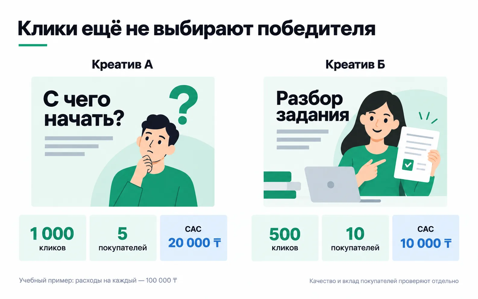
Even with these numbers, the decision doesn't stop at CAC. If buyers from the second creative later ask for refunds more often, the gap between them shrinks. So the order is: compare the cost and quality of the purchases, then work out why the first creative's clicks don't turn into payments.
Why comparing ads is not yet an experiment
When an ad set holds several ads, Meta shows each person the one it predicts will get the lowest cost per result, so the ads get different numbers of impressions. In the centre's test the lesson ad got 2,000 of 12,000 impressions. The system decided that from its own predictions, and it knows nothing about trial lessons at all: only leads reach the ad account. So the table says almost nothing about the process angle; it simply got few impressions.
To compare angles on equal terms, use A/B testing in Ads Manager. Meta splits the audience so that each person sees only one version, and recommends giving the versions the same budget. At 10,000 ₸ it's too early: three versions at 3,300 ₸ each, at the test's CPL, would bring three or four leads apiece, and the difference would drown in noise. An A/B test earns its place when money depends on the answer, for example when the centre is about to shoot a series of videos and wants to know which angle will pay for the shoot.
What to do with the next creatives
Keep a creative log: one row per ad, with its name, angle, dates, spend, leads and how many people reached the lesson or the purchase. Use the same name the ad has in the ad account (problem, result_price, lesson), and then UTM tags tie every lead on your list to its creative. After a couple of tests the log shows which angles work in your niche, and the next creative builds on those rows. A request to "make it pop" adds nothing to the log.
Build new versions inside the angle that did better on cost per person who came, once the gap rests on more than one or two people: a different image, a different opening line, the same offer. A new ad in an ad set restarts learning, so the scaling plan decides when to add it.
Exercise: three creatives for your own test
Make three creatives for your week 2 test campaign. The result is a folder with three creatives and a table of promises.
You're done when the three creatives share one offer with different angles (problem, result, process) and every promise they make is on the landing page.
If a row in the promise table has no place on the page, decide whether it is true. If it is, add it to the page; if not, take it out of the creative. Check prices word for word: "45,000 ₸" in the ad and "from 45,000 ₸" on the site are already two different promises. If your result angle ended up being about an exam score, rewrite it around what you yourself deliver: the plan, the mock exams, the feedback on mistakes.
Then put the three creatives side by side. If all three start with "IELTS prep course" and differ only in the photo, the test will compare photos, not angles. The opening line sets the angle, so each creative needs its own.